
Table of Contents
Ticket List
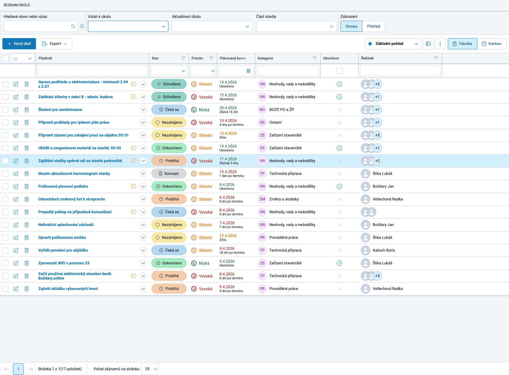
The top row of the window contains filters that determine how much data is loaded from the server into the list below. Using these filters can significantly speed up loading the list, especially when hundreds or thousands of tickets have been created for a project.

You can filter by:
- search term ⇒ after entering a keyword, the following fields are searched: subject, description, statement, category, and labels. The resulting list contains all tickets where the word appears in any of the searched fields, including inflected forms. The word therefore only needs to be entered in its basic form.
- relationship to the ticket ⇒ selection of tickets that the user created, is assigned to, needs to approve, etc.
- ticket status and deadline ⇒ for example current / this week / overdue / unfinished / completed, etc.
- project part ⇒ if the project is divided into parts (in Project Settings → Project Parts and Drawings), tickets concerning only a selected part can be displayed.
- view ⇒ by default, this is set to “Project”, meaning tickets concerning the current project. The second option is “Overview”, where the list contains tickets across all current projects with the Ticket Management module enabled where the user is assigned with the appropriate permissions.
Additional filters are then available in the grid (table) header. These work with the data that has already been loaded.
Working with the Grid

The Ticket List is displayed as a GRID. The grid is an exceptionally flexible tool that allows tickets to be sorted, filtered, and grouped in the way that best suits each user's needs. The number and selection of fields can also be customized.
Each change to the grid layout creates a new VIEW. A view can be saved and set as the default view whenever the page is opened.
Users can switch freely between saved views depending on which parameters they need to monitor at a given time.
View Configuration

Each user can individually configure which parameters they want to display in the grid and how they want them displayed, creating their own system of views. This is done using three buttons located directly above the grid on the right. From left to right, they are:
View Selection
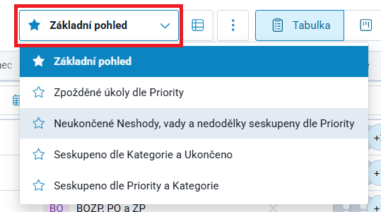
contains all saved views, which the user can switch between as needed.
The code list contains 5 predefined views, but each user can add their own.
The selected view is set as the default and will be displayed whenever the page is opened.
View Management
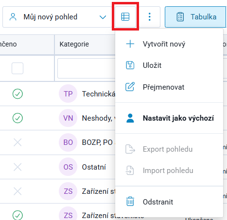
is used to create, name, rename, or delete views, set the default view, etc.
If a user makes changes to the grid, such as adding or removing columns, moving them to a different position, etc., and wants to preserve these settings, they can name and save the view using this option.
More Options = Three-Dot Menu
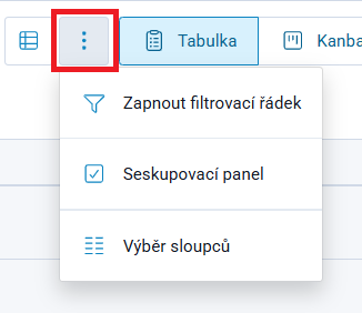
allows the user to select exactly which columns they want to include in the view from the code list, or add a grouping panel, into which one or more parameters can then be dragged from the header.
Grid Configuration
1. Grid Layout
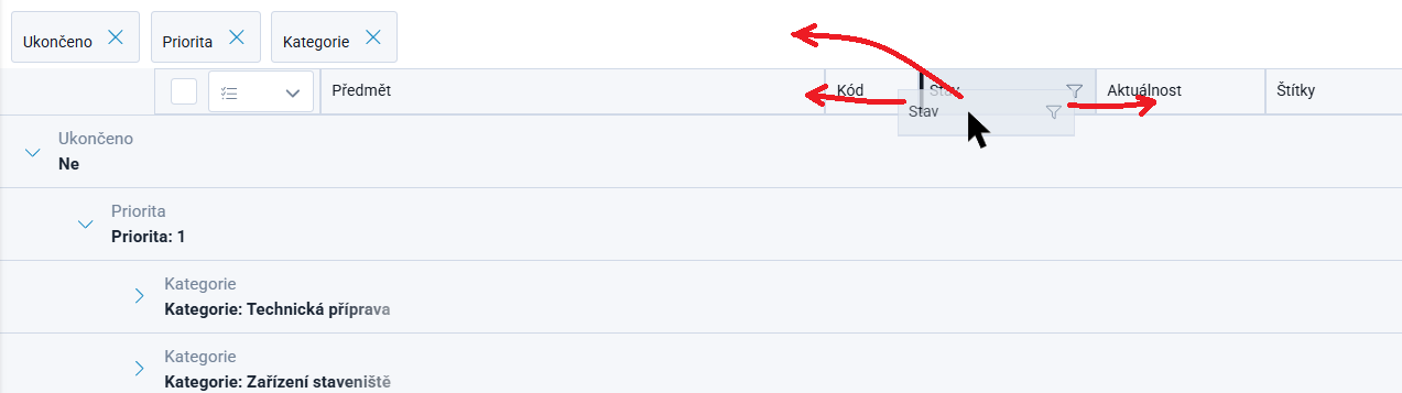
The grid layout can be changed very easily. Using the left mouse button, any column can be grabbed by its gray header and moved to another position in the grid, either to the left or right, or to the grouping row above the grid (the grouping row must first be created using the “Three-Dot Menu” described above).
Multiple criteria can be added to the grouping row, and their order can be changed in the same way.
An example of a grouped layout is shown in the image on the right.
2. Sorting Column Values
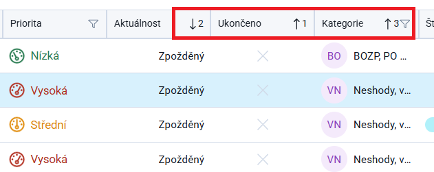
Items in columns can be sorted in ascending or descending order, including across multiple columns at the same time. In this case, the sorting priority is indicated by the order in which sorting was applied to the columns.
Clicking a column name in the grid header enables ascending sorting of the values in the column, indicated by an upward-pointing arrow. Clicking again reverses the direction and applies descending sorting, with the arrow pointing downward. A third click disables sorting and the arrow disappears.
The second column can be added to the sort using Shift + left-click. To change the sorting direction, use Shift + click again. To stop sorting only this column, also use Shift + click.
The same method can be used to sort additional columns.
To stop sorting for all columns at once, simply click the header of a column with a downward-pointing arrow. If all arrows point upward, click any of them. The arrow will change direction and all other sorting indicators will disappear. Clicking it again removes the remaining sorting as well.
3. Grid Filters
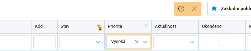
A filter row is located below the gray grid header.
Different types of filters are available depending on the nature of the column. Some contain text fields for entering a search term, others provide a code list for selecting a value, while others contain a calendar for entering dates, etc.
If an orange frame appears above the grid, it indicates that a filter has been applied and the grid is displaying filtered data. Clicking the cross in this notification disables all filters on the grid.
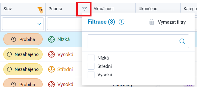
Some columns contain a filter icon directly in the header  → in these cases, multiple values can be selected at once. The orange highlighting of the icon and the number indicating how many values have been selected for the given criterion show that this filter is active - see the image on the right for the Status criterion.
Working with Tickets in the Grid
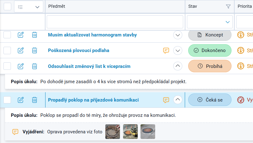
Edit Ticket is available via the  icon or by clicking the Ticket Subject. In both cases, the Ticket Details window opens, where the required changes can be made.
Delete Ticket is available via the  icon.
icon.
For each ticket, the Ticket Description and Statement can be viewed without the possibility of editing them.
The  icon expands the Ticket Description details and, if available, the latest entry in the Statement thread (see image).
The  icon indicates that a Statement exists for the ticket and opens the entire Statement thread with its associated records.
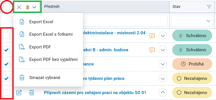
The application allows users to select tickets and then perform bulk operations, such as deleting tickets or exporting the selected tickets.
Selecting the checkbox in the grid header selects all tickets at once. You can then deselect the checkboxes for tickets that should not be included in the selection. In many cases, this can be the faster approach.